Maytag Commercial
Visual Identity
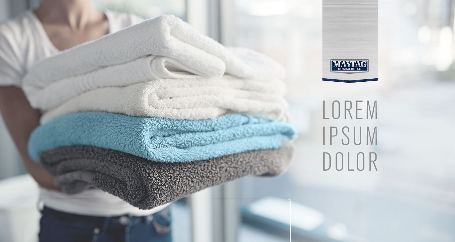
Most of the existing commercial laundry segment was very product focused, with large, heavy imagery of machines and dated laundromat interiors with sickly florescent lighting dominating their marketing material. We wanted to take the Maytag materials in a more aspirational direction, imagining what the ideal laundromat environment for the consumer would look like.

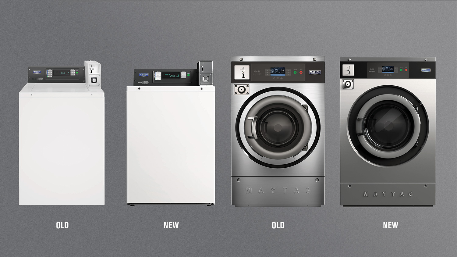
Imagining a space that was light, bright, and airy — awash with soft window light, we recommending pivoting to a photography style that utilized a similar lighting style. Moving from overwhelming heavy stainless steel and denim textures and large chunky typography, we utilized a lighter condensed font face still within their main brand font and lighter layouts full of white space. We also recommended shifting the rendering style of the product photography to include a similar lighting approach as the lifestyle and environmental photography to help clearly show the physical profile of the machines.

To help the client be able to visualize how this shift in strategy would apply to various projects, we developed a couple of photography and texture tone boards. We developed a design element and layout tone board to demonstrate the new approach to typography as well as the family of graphic elements we had created. We also worked with our in-house video producer to create some sample renders of their products so they could clearly understand our recommendation for product renders.
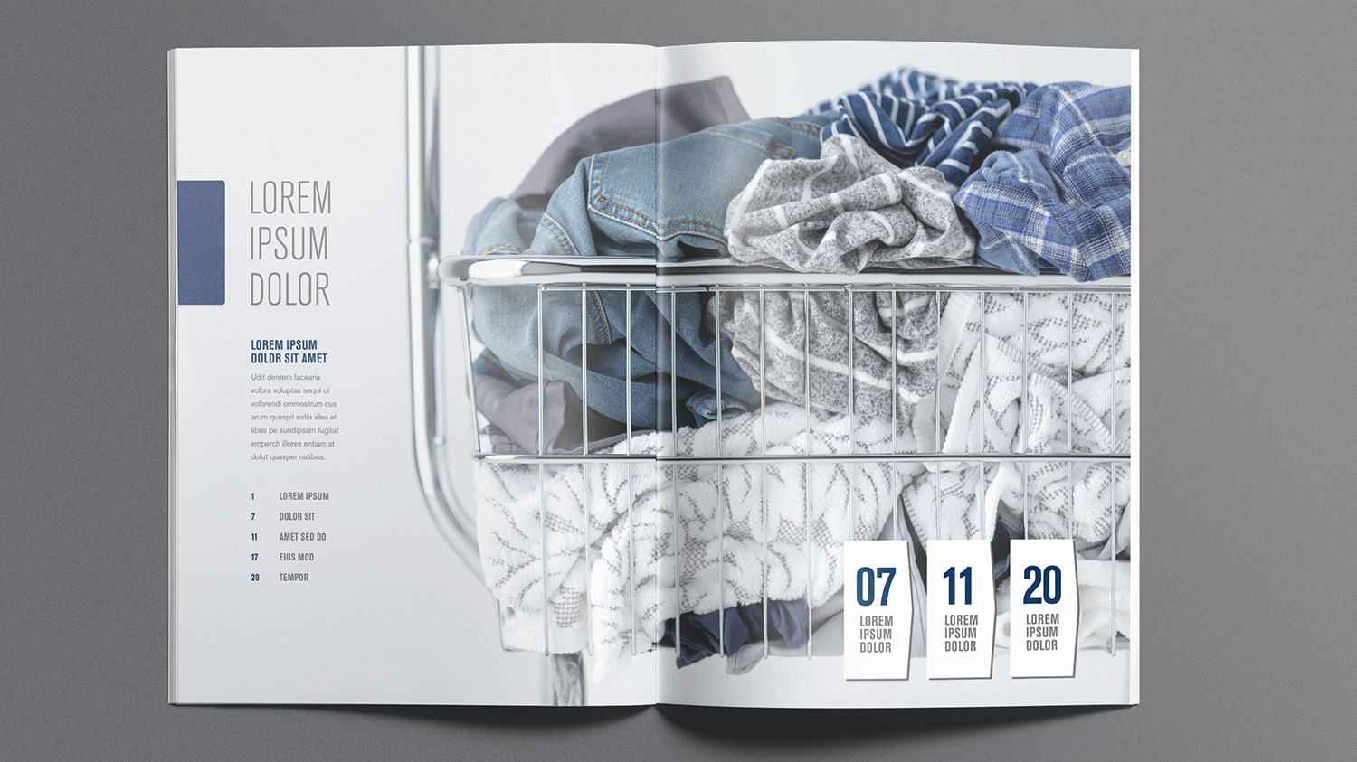
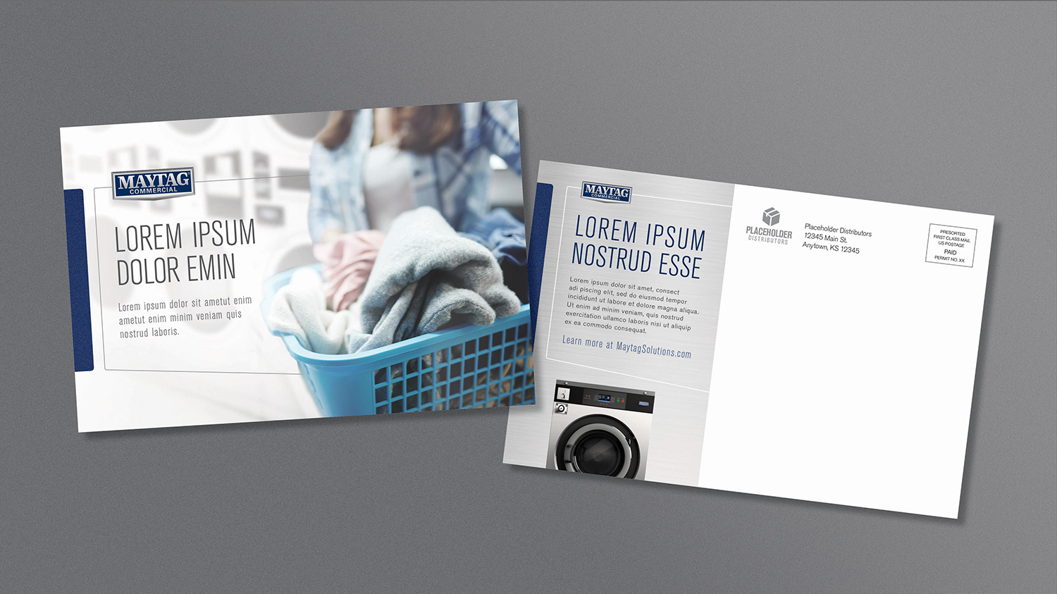
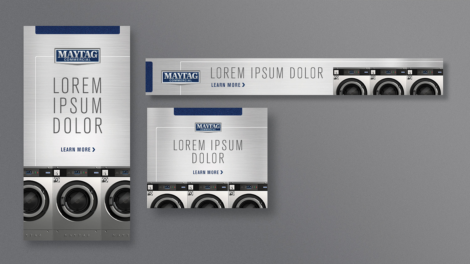
And finally, as a proof of concept, we explored a number of different applications to a variety of tactics to flesh out how the creative approach would look across the various channels we managed for the client. These ranged from a multiple page brochure layout to direct mail post cards to digital banner ads.
