ABI Brand Strategy
The Challenge
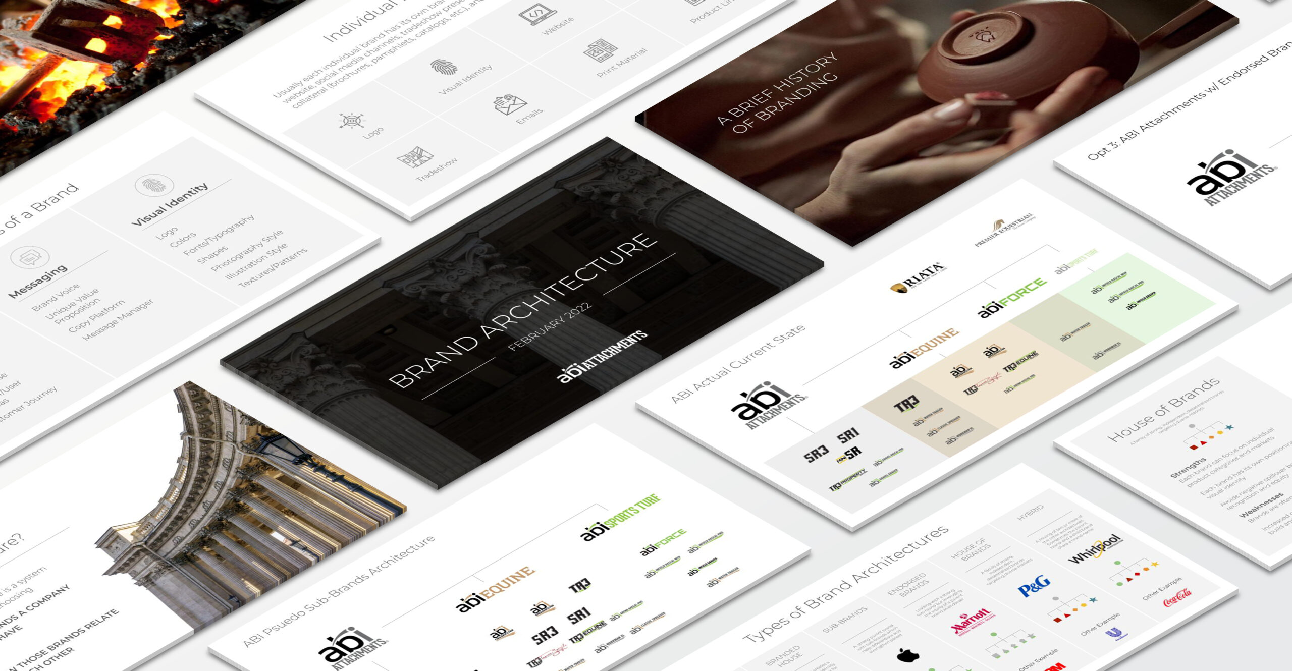
When I arrived at ABI Attachments, the company had a confusing collection of psuedo-brands for each of their marketing segmentations as well as a handful of product brands that already had a good deal of recognition and equity.
Internal and External Confusion
The marketing team was confused as to whether ABI was trying to be a house of brands or a branded house and there were major business developments looming on the horizon that would need clarity in brand direction before they could be implemented. Customers were confused as they interacted with different brands at different stages of the buyer’s journey with one brand being at trade shows, and another on the website, and back to the first brand in email communications.
Brand Architecture Strategy
Over the course of three months, I worked closely with one of the owners, who was serving as Acting Director of Marketing, to get him up to speed on brand architecture and brand strategy.
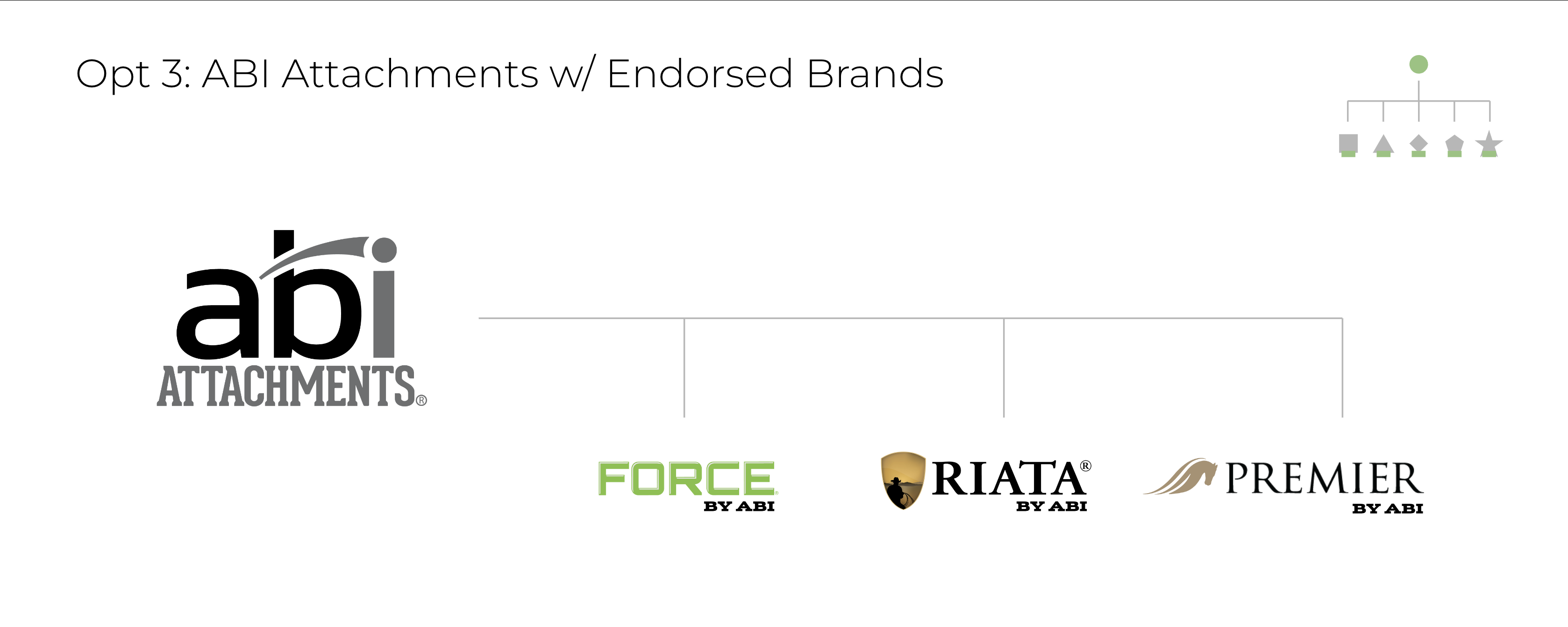
We worked through all the different brand architecture options and settled on the Endorsed Brands approach as the best strategy for ABI to clean up the current brand family and also position the company for upcoming business developments and future expansion, culminating in a presentation to the Executive Team and getting their approval of that approach.
ABI Attachments Logo Redesign
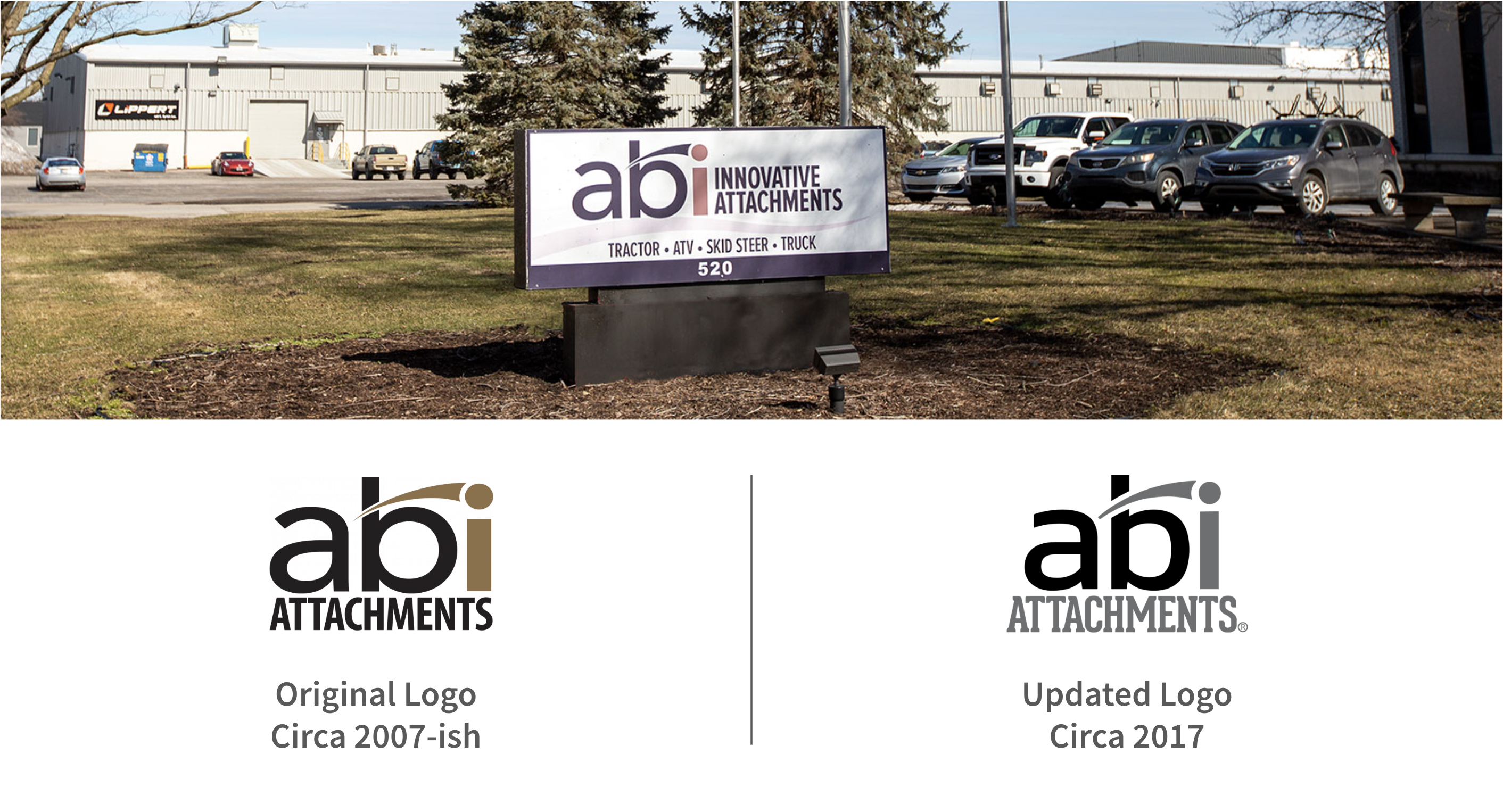
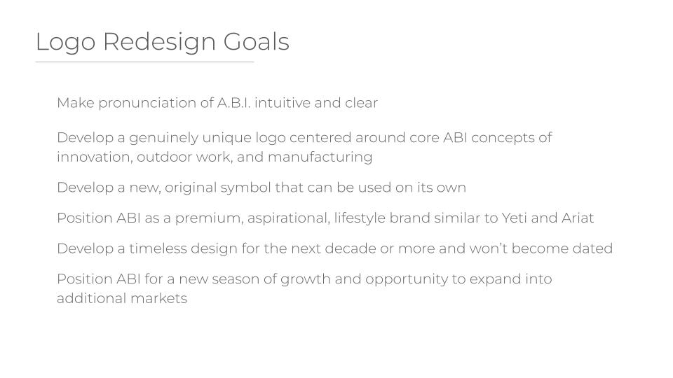
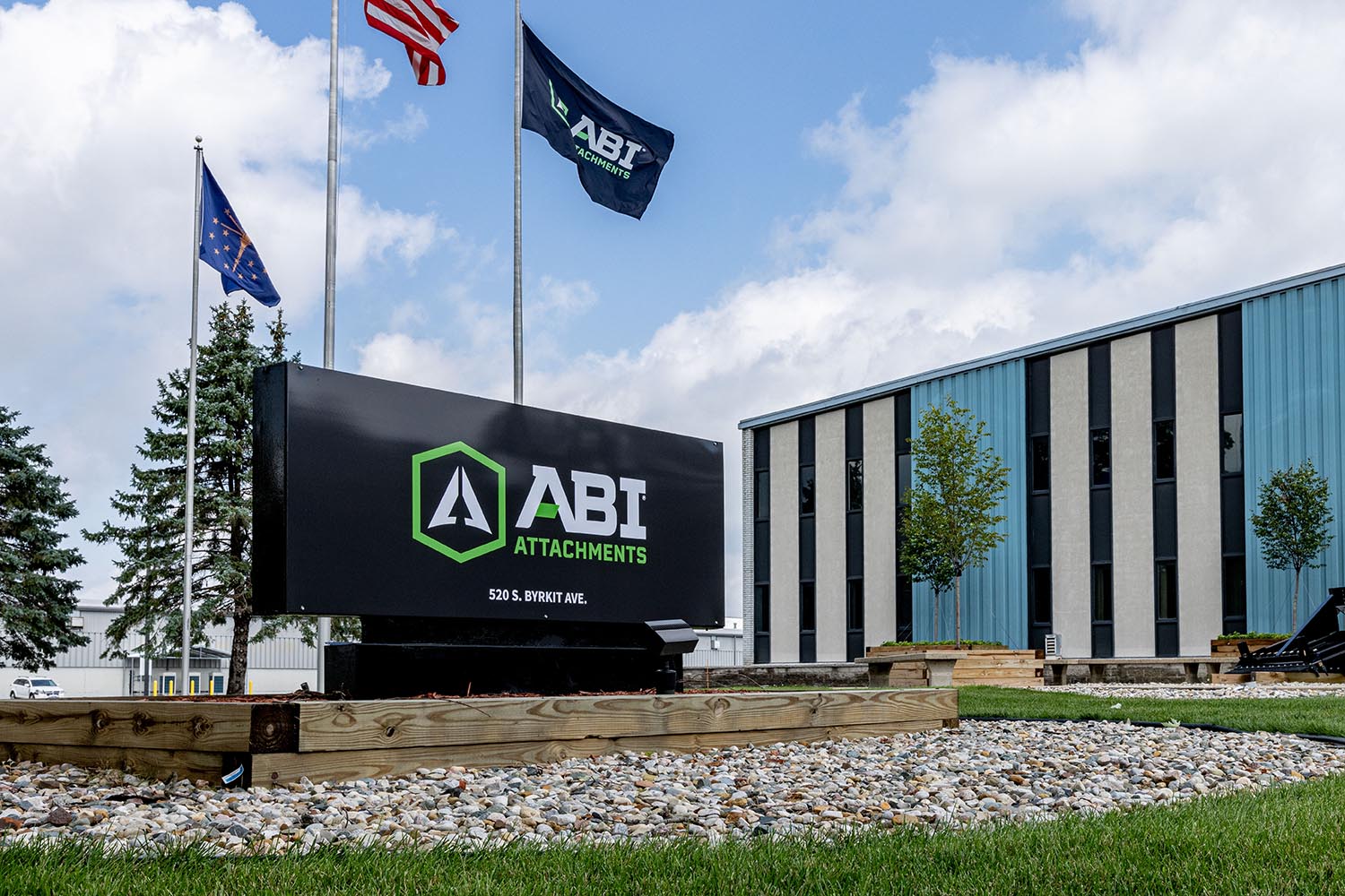
With a Brand Architecture strategy approved, the Owner/Acting Director of Marketing next wanted us to tackle a company-wide rebrand for the ABI Attachments brand. Each member of the Executive Team had their own issues with the current logo which had been in use for 15 years with only one slight update with the original logo still being used in various places like building signage and email signatures.
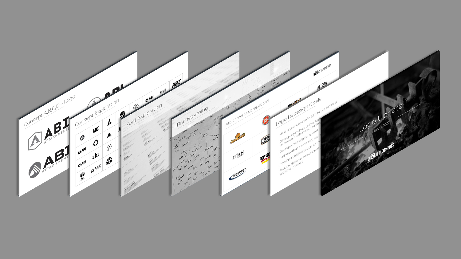
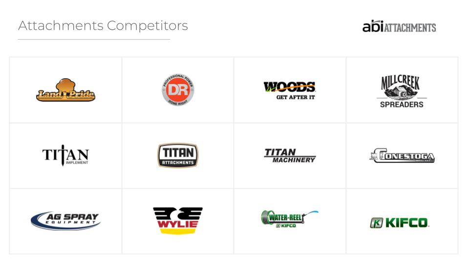
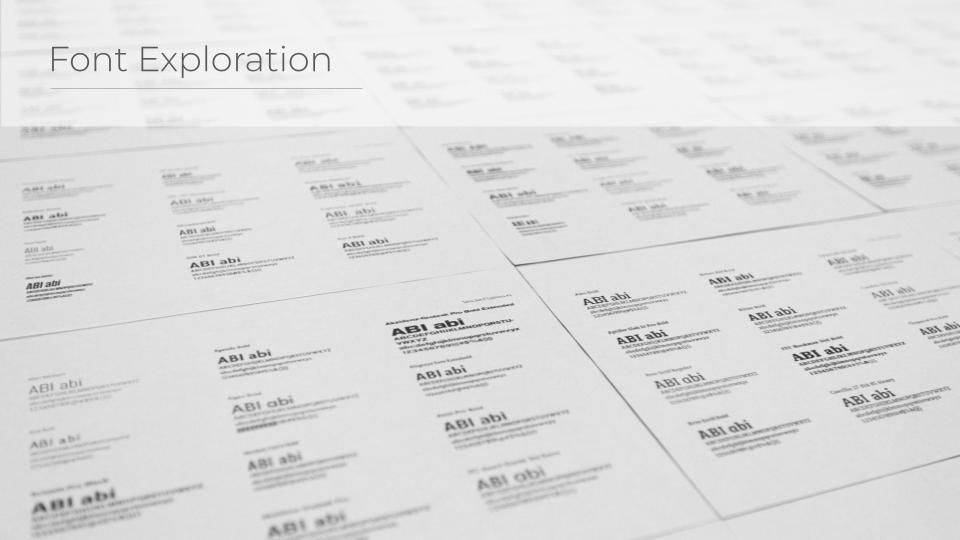
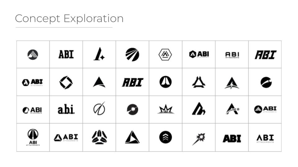
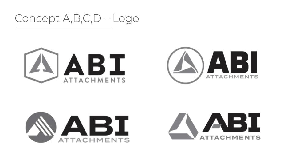
To make sure we were heading in the right direction, we gathered requirements from each of the Executive Team members, conducted competitor research, engaged in brainstorming, explored the various font options, and developed multiple conceptual directions. These were then reviewed, refined, and narrowed down to a final four concepts by the Activing Director before being presented to the Executive Team.
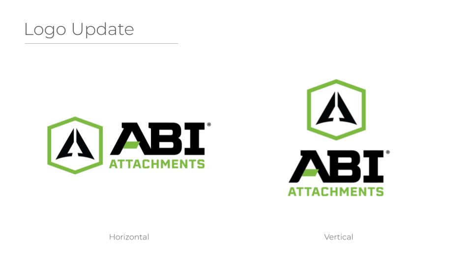
Consensus among the Executive Team was clearly behind one particular concept centered around the idea of stylized profile blades forming a triangular shaped capital A with an upwards arrow over a horizon in the negative space held within a hexagonal shape like the head of a machine bolt. Taking their feedback and incorporating different elements of the other concepts that they liked, we were able to finalize a new logo that everyone on the Executive Team and on the Marketing Team was really happy with.
Visual Identity and Implementation
With a new brand strategy and logo design approved, it was now time for our team to develop a new visual identity for the brand, centered around the new logo, and roll that out across all of the marketing materials for the entire company. This included update brand fonts and typography, a refined color palette, expanding our brand textures and patterns, and a new, customer centric photography approach.
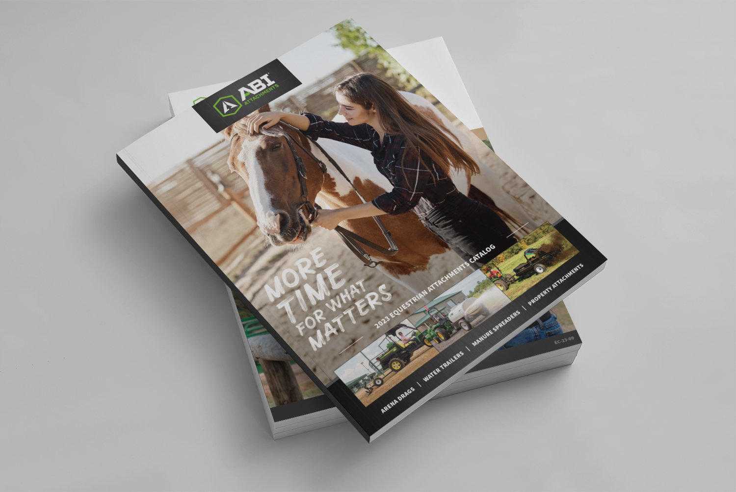
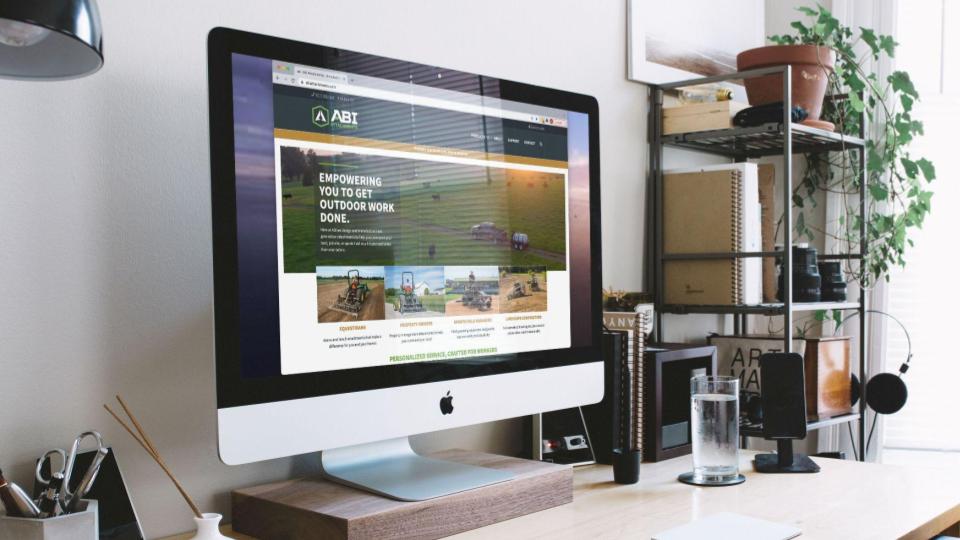
Over the course of the next year, we coordinated with other departments including purchasing, engineering, production, customer service and sales to apply the new brand to the company’s website, product decals, catalogues, brochures, building signage, tradeshow booths, and apparel.


